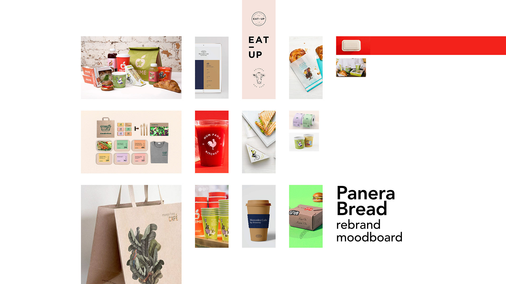
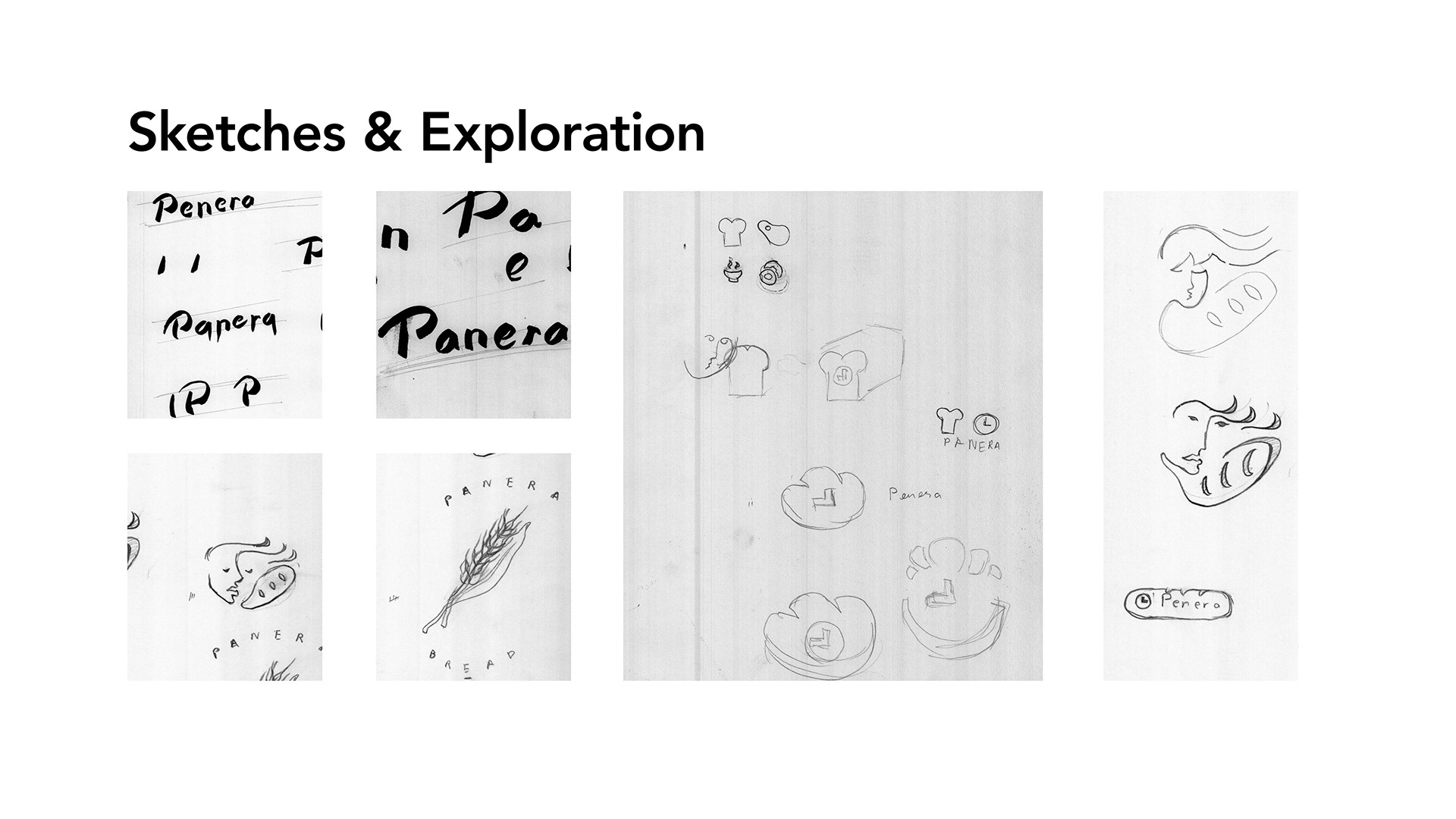
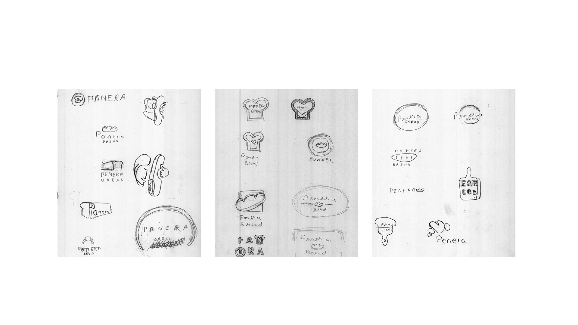
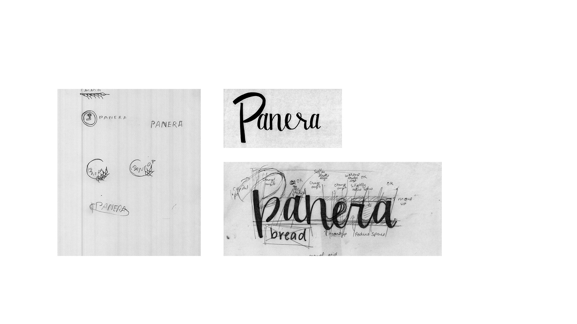
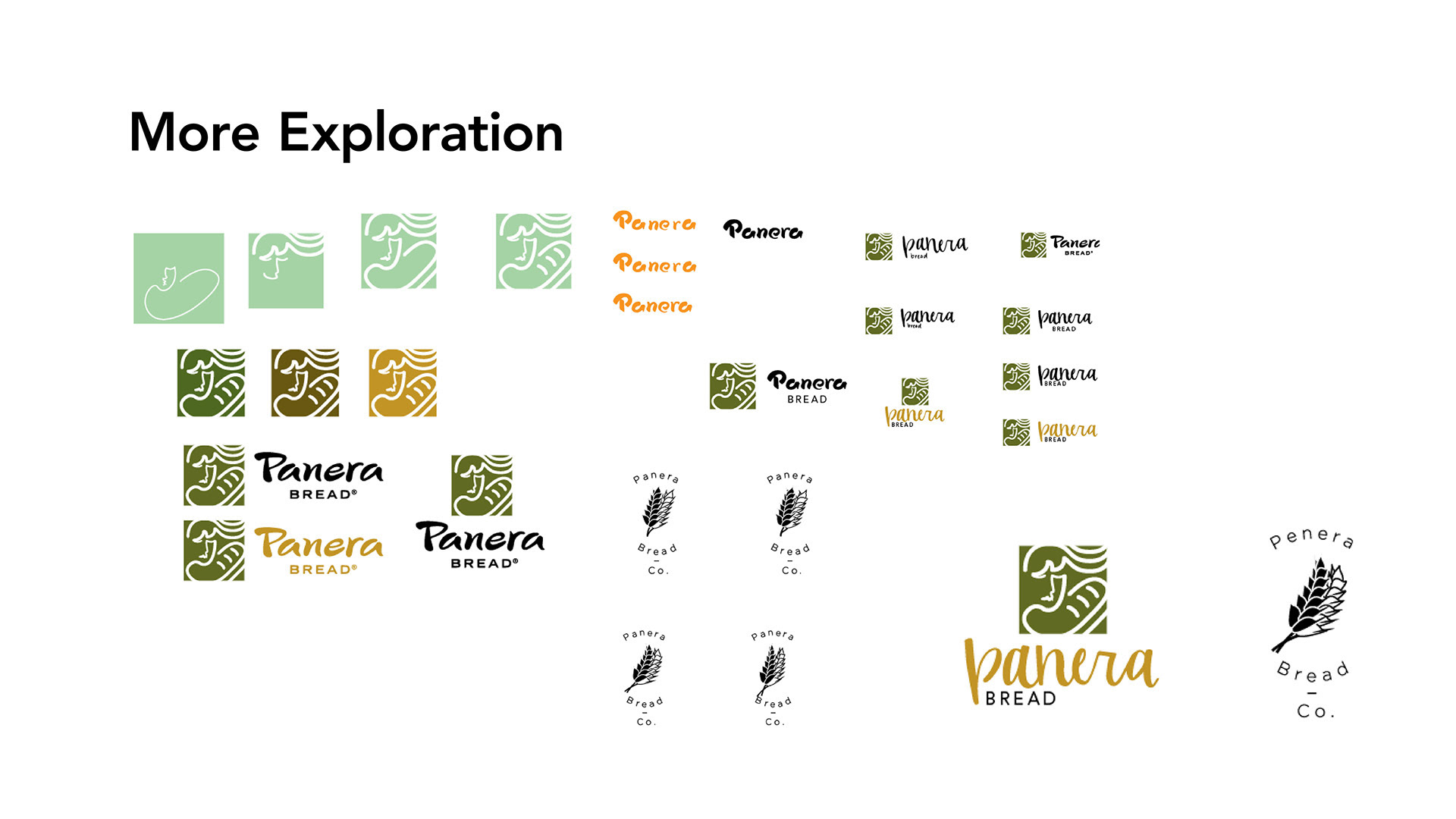
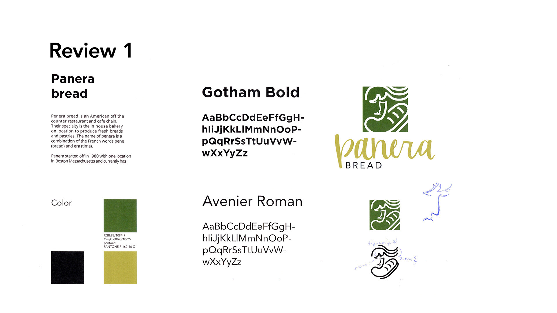
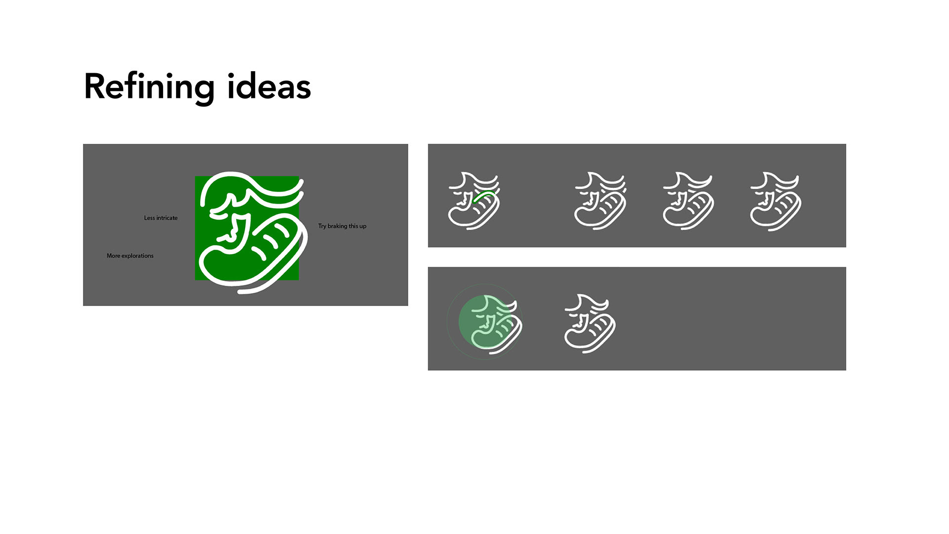
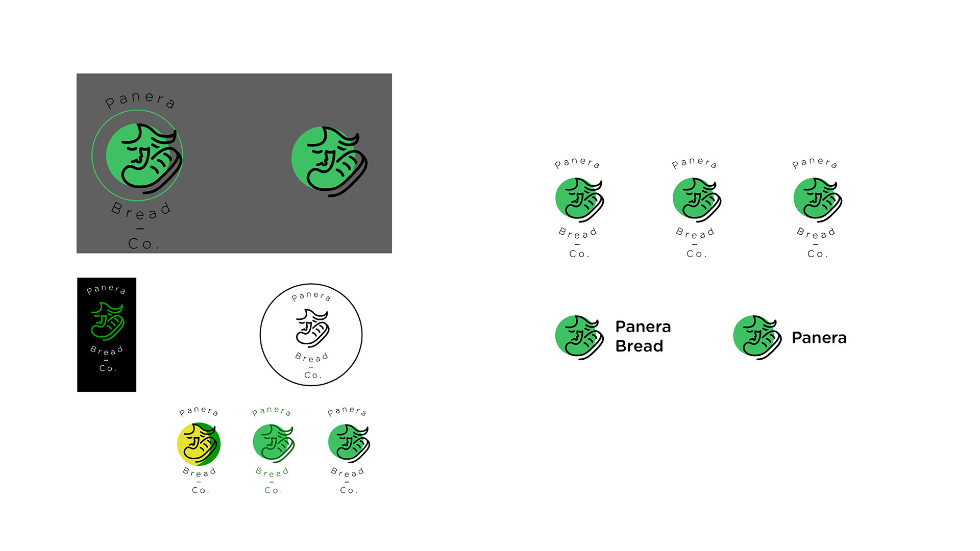
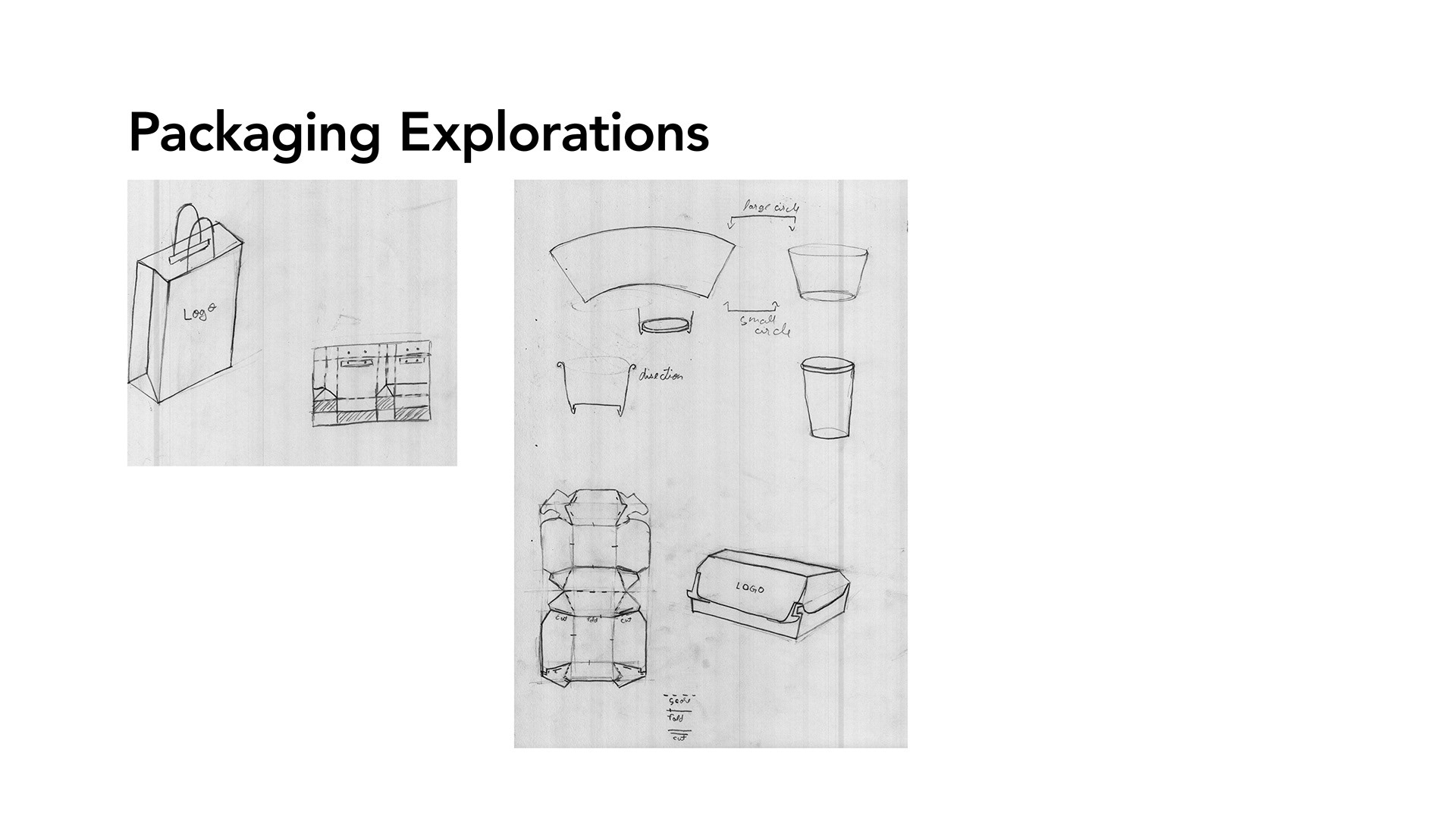
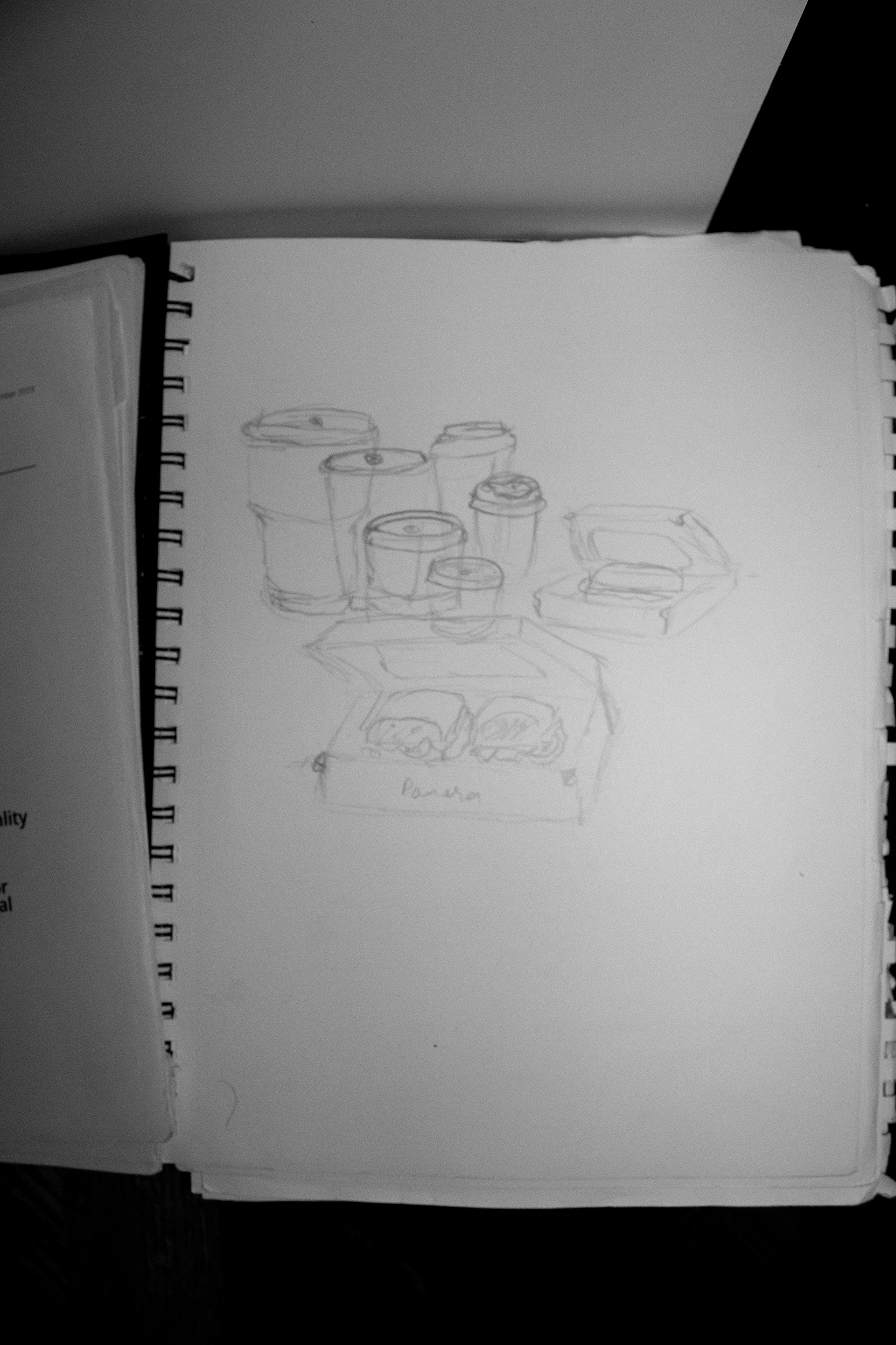
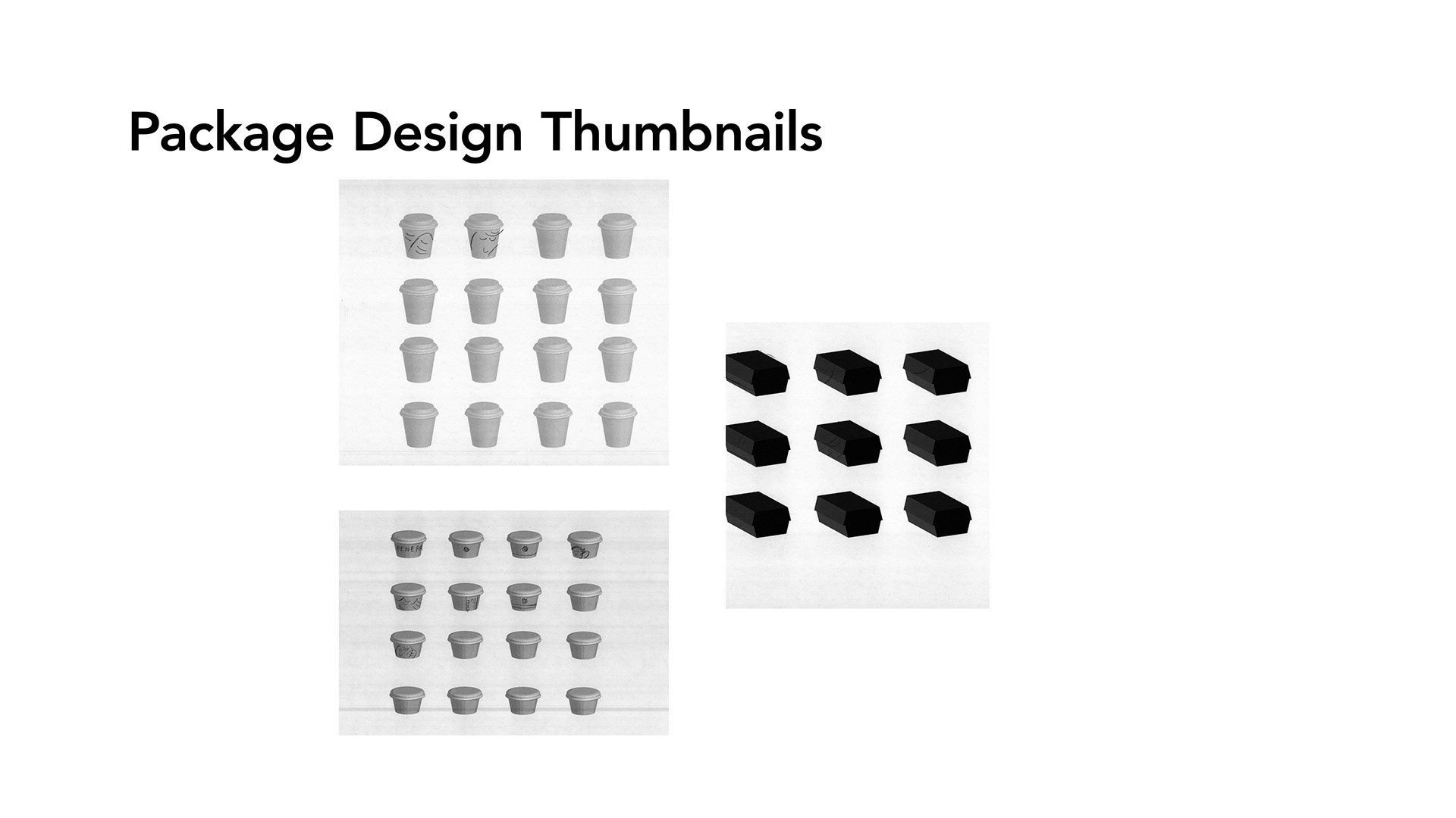
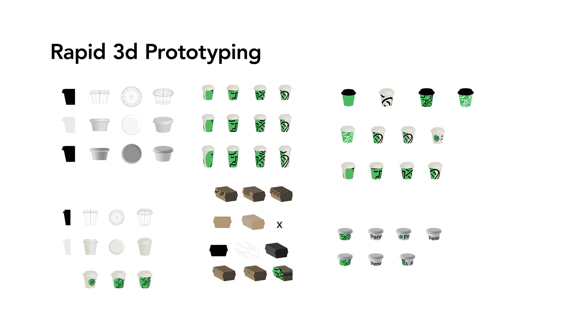
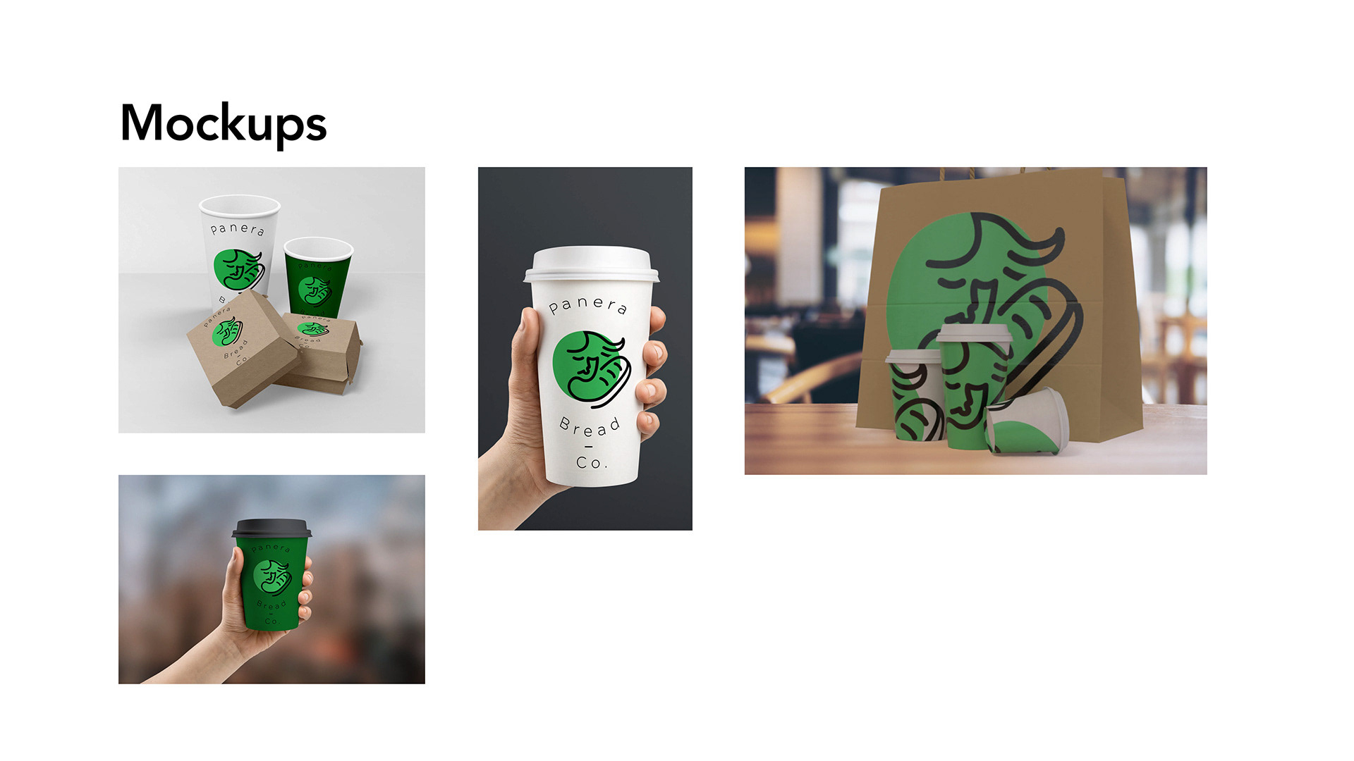
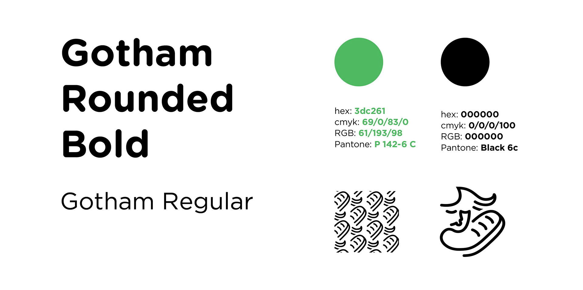
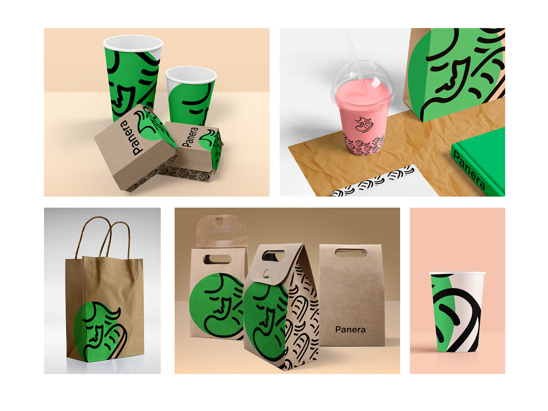
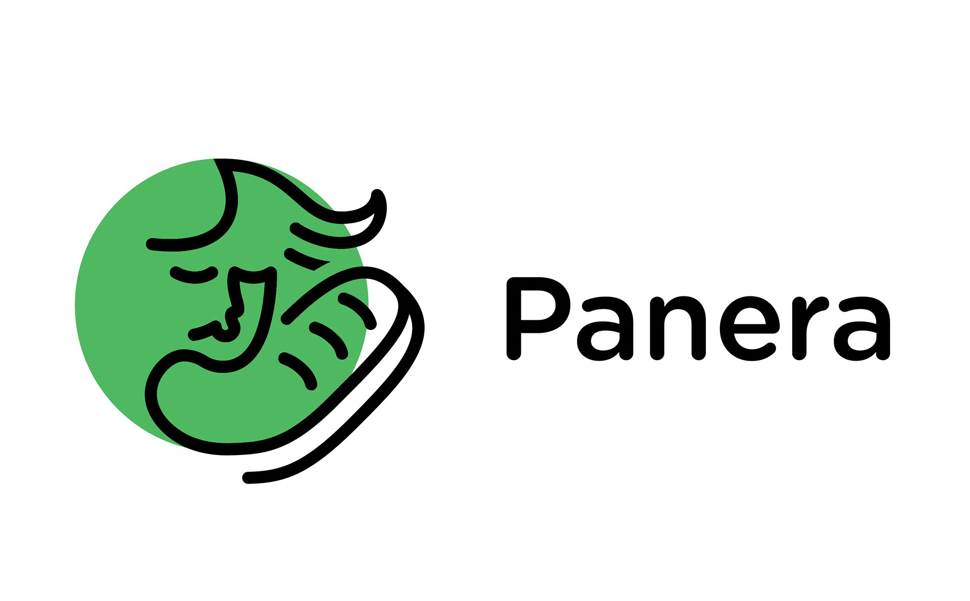
The New Panera brand looks to new horizons while not alienating its current audience. The redesign is a play off of the lady and bread logo used by panera earlier but is a bold refresh. It fixes the scalability issues while being a more simple, strong solution which makes it very versatile. The logo lends itself well to a variety of applications and range of use from the packaging to Online advertising. It is intended to convey a fresh image for the traditional bakery and of the counter cafe.